 The Vertex Journal
Practice
The four dashboards every data team builds, reviewed as a genre
The executive mosaic, the wall of red, the vanity grid and the one that works. A taxonomy, with verdicts, of the artifacts BI budgets actually produce.
By The editors · · 3 min
This journal reviews platforms, but platforms are means. The end product of most data budgets is dashboards, and after enough platform reviews one notices the same four dashboards being built on every one of them, at every company, in every tool. A genre deserves genre criticism. Verdicts included.
The executive mosaic. Twenty tiles, every metric that anyone senior ever asked about, refreshed hourly, opened weekly at best. The mosaic is not an analytical artifact; it is a peace treaty, each tile the settlement of some past meeting's argument. It cannot be deleted because each tile has a patron, and it cannot inform because twenty numbers with no hierarchy is zero numbers with extra rendering costs. Verdict: marketing, aimed inward. The kindest fix we have seen is a quarterly tile audit with open-rate data on the table; treaties get renegotiated when the cost of the standing army is printed.
The wall of red. The operations dashboard where a third of the indicators have been red so long that red is the ambient color. Its authors built alerting into coloring, then learned the alerts were miscalibrated, then adapted by reading around the red, which is to say the dashboard now transmits information only to people who already have it. Verdict: wait, in the specific sense of waiting for someone to reset the thresholds. A signal that is always on is furniture. (Our standing rule from the minimum viable data quality review applies: fewer checks, believed, beat many checks, ignored.)
The vanity grid. Rows counted, users counted, pipelines counted, everything counted, nothing questioned. It exists because counting is what the platform makes easy on day one, and it survives because growth curves photograph well in quarterly reviews. The tell: every metric on it goes up and to the right by construction. Row counts do not go down; that is what makes them row counts and not decisions. Verdict: marketing again, aimed upward this time, and harmless until the quarter someone mistakes it for the business.
The one that works. Every company has one, usually unglamorous, often half-ugly: the dashboard a specific team opens every morning because a specific decision depends on it. Ours, for the record, is a single page of subscription and correction numbers. Its properties are worth stating, because they are the entire craft. It answers one question its owners actually recur to. It has a person who curates it and deletes from it, deletion being the feature the other three genres lack. Its thresholds page someone when crossed, so the dashboard is not the alerting system, merely its public face. And it is allowed to be boring, which is how you can tell it is load-bearing; decoration gets redesigned, infrastructure gets maintained.
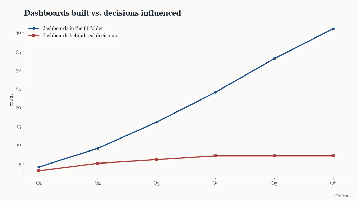
The chart above plots the genre problem in one picture: dashboard count grows linearly with platform maturity while decisions influenced flattens early, and the gap between the curves is pure carrying cost: refresh compute, maintenance, and the attention tax of every stakeholder who must pretend to consult the mosaic. The second chart, below, is the audit we actually recommend: for each dashboard, opens per week against cost per week, with the delete line drawn where the journal draws it, at "nobody opened this since the last review".
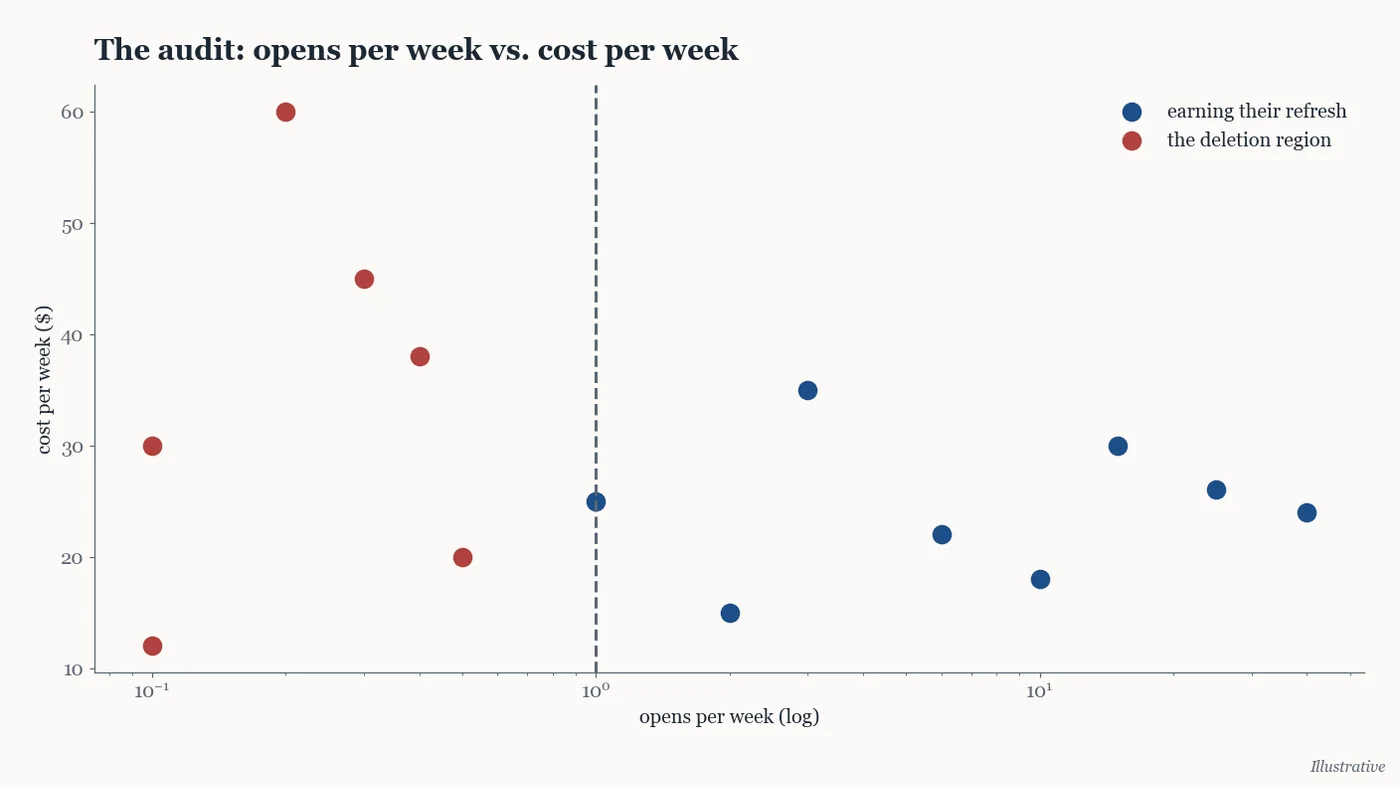
The uncomfortable conclusion, stated plainly since that is the house style: dashboards are inventory, not achievement. A data team's maturity is measured better by what it has deleted from its BI folder than by what it has published there, and the platform migrations we review would go faster if the mosaic, the wall and the grid were left behind to rot on the old system, which is, quietly, what the best teams do. Verdict for the genre entire: build the fourth kind, audit the rest annually, and treat any dashboard without a named owner and a named question as what it is, which is compute spent avoiding a conversation.